Thursday 3 December 2015
Thursday 12 November 2015
Viral Marketing Campaign
Evian Baby&Me
This video was released in April 2013. It started off as just an advert, then soon became one of the most viral marketing campaigns and biggest, successful adverts for Evian as a company. The video has gained nearly 115 million since being released.
In fact it grew so popular that Evian created a baby&me app where the app users were able to 'babyfy' themselves.

It seems the video is definitely something Evian are still proud as links, such as the behind the scenes footage,are featured on the website's home page.

What made it so successful?
Well in order for a campaign to go viral it must be unique and stand out. This campaign, with emphasis on the video, was clever within the fact that it was out of the ordinary which made it more memorable. The start of the video doesn't contain any anchorage therefore the viewer doesn't know what to expect making it more likely to grab their attention to fulfil their surveillance needs which is the need to for further knowledge. Overall the video is cute and funny which makes it entertaining therefore more people are likely to share and talk about it.
Tuesday 23 June 2015

Thursday 12 February 2015

Monday 15 December 2014
MEST2: Coursework Research
TV
Channel Logo Analysis
For my
coursework I have decided to do brief two (Synopticity Productions). To kick
off my research I will begin to look at and analyse the logos of TV channels
that broadcast a certain genre of lifestyle programming to get an idea of how
they appeal to a certain target audience so that I can apply this to my own
logo when I begin to create it.
 Home is
an interior home and garden-oriented lifestyle television
channel broadcasting in the United Kingdom, as part of the UKTV
network of channels. The home channel logo is a fairly plain red which
indicates that the target audience is mature adults that don’t need bright and
flashy colours to attract them. Whereas if the channels target audience was a
younger crowd the logo would probably be more colourful. In this particular
form of media I think the colour red demonstrates that the target audience is
both males and females because the colour is associated with both genders
equally. It looks professional which reflects
the fact that the channel stars professionals at work and therefore links to
the channel and the channel’s aim well. The text of the logo is in an italic
font which is effective because it highlights that the channel is about designs
and things looking good which is likely to attract those who like their homes
looking on point. The white lines in the circle remind me of paint lines which
personally I think is really clever because now the logo completely represents
what the channel is about: interior design and other things to do with home.
Home is
an interior home and garden-oriented lifestyle television
channel broadcasting in the United Kingdom, as part of the UKTV
network of channels. The home channel logo is a fairly plain red which
indicates that the target audience is mature adults that don’t need bright and
flashy colours to attract them. Whereas if the channels target audience was a
younger crowd the logo would probably be more colourful. In this particular
form of media I think the colour red demonstrates that the target audience is
both males and females because the colour is associated with both genders
equally. It looks professional which reflects
the fact that the channel stars professionals at work and therefore links to
the channel and the channel’s aim well. The text of the logo is in an italic
font which is effective because it highlights that the channel is about designs
and things looking good which is likely to attract those who like their homes
looking on point. The white lines in the circle remind me of paint lines which
personally I think is really clever because now the logo completely represents
what the channel is about: interior design and other things to do with home. Travel
Channel is an American basic cable and satellite
television channel that features documentaries, reality,
and how-to shows related to travel and leisure around the United
States and throughout the world. The logo is blue which is conventionally
associated with the sky and water which is effective because it can be
linked to travel as most people travel internationally on water for example in
ferries or in the sky in an aeroplane and therefore the colour links to the
channels genre. The fact that the logo is bright makes it appealing and
attractive which may inspire a younger audience to watch it because it is
usually younger people that move and travel. The logo looks like an arrow
which to me reflects movement and is clever because travelling is all about
movement. The font for the logo is very laid back and informal which also
suggests that the channel is targeted at an early 20s to mid-20s audience.
Travel
Channel is an American basic cable and satellite
television channel that features documentaries, reality,
and how-to shows related to travel and leisure around the United
States and throughout the world. The logo is blue which is conventionally
associated with the sky and water which is effective because it can be
linked to travel as most people travel internationally on water for example in
ferries or in the sky in an aeroplane and therefore the colour links to the
channels genre. The fact that the logo is bright makes it appealing and
attractive which may inspire a younger audience to watch it because it is
usually younger people that move and travel. The logo looks like an arrow
which to me reflects movement and is clever because travelling is all about
movement. The font for the logo is very laid back and informal which also
suggests that the channel is targeted at an early 20s to mid-20s audience.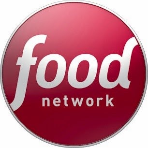
The
food network is one the first networks solely dedicated to food however without
the anchorage of the text it would be unclear as to what it is a logo of. Therefore
proving text is almost essential on logos that have a basic shape and that are
not widely recognised. One of the reasons this logo may not be widely
recognised is probably because the channel has a very niche target audience, to
be specific: those who enjoy food and food related entertainment. The logo is
very sophisticated, it uses a maroon colour as the base of the background which
indicates maturity as it isn’t a flashy or bright colour therefore adding the
element of class. This conveys that food network is a classy channel which just
shows how important it is to display a certain ‘message’ about a channel. The text
appears to be one set font-which as shown by the previous logos I chose to
analyse- appears to be conventional. This particular font highlights neatness,
the ‘f’ and the ‘d’ of the word ‘food’
have almost italic like flicks that are visually appeasing which
emphasise that appearance is important to the channel. Expanding on the fact
that the font looks neat this may have been done to convey the fact that the
channel airs clean-cut professional looking programmes and that it itself is of
a good standard.
Creation
of My Own Logo
For my
research I created my own potential/practise logos as I believe analysing and
criticising my own designs will help me create a strong final logo for
Synopticity Productions.

For this
logo I used a clip art type image of factory like industrial buildings as the
main aspect, I think it is effective as immediately the word productions
reminds me of a factory so I thought it would be a clever representation of the
company. There are plant like patterns on the image which I decided to include
to represent that, just like plants, Synopticity Productions is a company that
is ever-growing and blossoming. In other words I wanted to create the idea that
it is a successful lifestyle production company through the use of the image.
There is a
mixture of black, sky blue and white used for the logo. I mainly used that
colour scheme because I feel the colours complement each other well and are
visually pleasing. The blue sets a neutral mood which I feel is important
because the flowers could give the impression that Synopticity is a girly
company only aimed at females because flowers are usually associated as
something women would be more interested in, so the blue was used to overcome
any misinterpreted gender bias.
 For this
logo I used a simple font for the name of the company because there is already
a lot going on in the central image of the logo therefore I didn’t want to use
any fancy fonts because I believe it would look ‘over the top’ and deduce from
the professional look I aim to achieve. I believe that a professional look is a
good convention to have to attract any audience because it creates a sense of
trust as the more professional something looks the more likely you are to trust
it. This would be effective for Synopticity because it portrays that it will be
trusted to produce things of a high standard through the use of this logo.
For this
logo I used a simple font for the name of the company because there is already
a lot going on in the central image of the logo therefore I didn’t want to use
any fancy fonts because I believe it would look ‘over the top’ and deduce from
the professional look I aim to achieve. I believe that a professional look is a
good convention to have to attract any audience because it creates a sense of
trust as the more professional something looks the more likely you are to trust
it. This would be effective for Synopticity because it portrays that it will be
trusted to produce things of a high standard through the use of this logo.
I also
decide to add the letters ‘S’ and ‘P’ to the central image in the same light
blue colour as some of the patterns and the text to almost brand the building
as Synopticity Production’s property.
This logo is a lot plainer than the previous one because I
wanted to represent a completely different idea about Synopticity Productions.
I decided that I was going to make the company’s name the main feature of the
logo so that it could instantly be recognised even to those who have only just
viewed it. I used white text on a black background because it enhances the
brightness of the white and makes ‘Synopticity Productions’ stand out. By doing
this I aimed to reflect that Synopticity as a company that stands out.
I used ‘Monotype Corsiva’ for the font of my
text as I feel it looks elegant, this increases the professionalism of the logo
and I believe it’s important for the logo to communicate this idea in order for
the company to be represented as successful.
I then
decided to include the use of white lines to create a rectangular like shape
around the text in order to frame the company’s name. By doing this I was
aiming to represent that Synopticity Productions is so good a company that it
deserves to have its own name framed as its logo because nothing else is worthy
of representing it.
Overall it
looks very basic which I wanted to use as a strong point to convey an almost
unconventionally brilliant idea however this may also be a weakness because,
without an explanation to the design, the logo could be misinterpreted and the
company may be represented in a way of which was not the aim.
 This logo is
slightly similar to the previous one because although I wanted to make sure
that I was open minded about how I would go about representing Synopticity
through different looking logos I also wanted to keep the element of
professionalism throughout.
This logo is
slightly similar to the previous one because although I wanted to make sure
that I was open minded about how I would go about representing Synopticity
through different looking logos I also wanted to keep the element of
professionalism throughout.
When
designing this logo I decided to use ‘Monotype Corsiva’ again as the font because
it gives across that fancy, dignified look which I believe is effective as it reflects
the company as elegant and professional which are good labels to have branded
to the name.
I made ‘S’ and ‘P’ the main element of this
logo joined together in a fancy way to abbreviate the company’s name. I believe
it’s effective because the two letters immediately become associated with the
company and, whenever seen presented in that way, the company will be the first
thing that will come to mind. This increases memorability of the company and
allows it to become well known.
Again I decided
to use a bold black rectangular border to increase the neatness of the logo.
The border frames the text and adds extra definition, I did this to represent
Synopticity as a company that cares about presenting itself as high
quality.
Final
Logo Design


This is my final logo
design. Firstly the reason there are two images presented above is
because I
have decided that I want to be able to change the colour scheme of my logo to
complement a certain product the company makes. As Synopticity Productions is a
lifestyle production company and there are many aspects that make up the
lifestyle genre, I felt that the freedom to have more than one set colour
scheme for my logo is appropriate.
With the flexibity of colour
scheme I think it’s important to set certain conventions for my logo so that
there is no confusion of brand identity.
As you can see I have kept a
bold border on both versions of the logo, I have done this because from my
draft ideas I noticed that having a well defined outline to any logo is
important as it increases the level of neatness. This reflects well on the
brand as it represent that they are imacculate and therefore will produce well
planned visually pleasing products.
Another convention I have
set for my logo is to have the ‘S’ of Synopticity in the font ‘Edwardian Script
ITC’ because I think it is very unique in the fact that there is a font change
in a singular word. Therefore Synopticity will be more likely to be memorable
as it is different. The font looks very classy and fancy and makes the logo
look that little bit more appealing than
to just have a simple font. I did this to represent Synopticity as a
sophisticated production company.
The rest of the text is in
the font ‘Californian FB’ which I decided to use because it still has that
element of neatness and elegance that I aim to achieve throughout my logo.
It compliments the font of the ‘S’ well
as it contrasts well with the other font and although different, both fonts
seem to unite.
In the logo the word
‘Productions’ will always be in capitals, have the same font and colour because
it makes the word look official and again adds to the professional look im
aimng to achieve for my logo.
Production
Companies Analysis
After
researching logos of other lifestyle production channels I have decided to look
at a production company specialising in lifestyle programming to help me gain
an understanding of the conventions I need in order to present Synopticity Productions
as a strong company. I will do this by researching e-media that they have
created. This will help me with my own coursework as I am opting to do one of
the e-media tasks.

Red House is a production company
that specialises in lifestyle programming just like Synopticity Productions.
Red House promotes itself by having its own
website. As you can see in the screenshot on the right they have a mission
statement like text on the welcome page of their website. The company begins to
promote itself in a positive light by discussing the success and high quality
of its programs and what it aims to achieve as a production company.
The red
house website has a very neat and professional looking house style. Red house
has deliberately gone for a plain but professional look because their programmes
are aimed at an older audience therefore their viewers are most likely to be
mature. By using a house style like that it indicates that it was created to be
aimed at other adults who are interested in finding out more about them because
adults are more likely to look for professionalism and are more likely to visit
a production company website solely to learn more.
It appears
the website has been created mainly to inform as there is hardly any
interactivity which makes it boring and it won’t encourage many people to visit
the page as there is a lack of attractive factors and things to view and do on
the webpage.
After
looking at this example of a webpage I have come to the conclusion that when
designing my own form of e-media I will aim to use a professional and neat
house style like Red House have. However I will use brighter colours to attract
a wider audience because when something is more visually desirable more people
are likely to look at it and I will apply this concept when creating my own
e-media product. I will also increase the interactivity of my e-media pages or
website to increase the purpose rather than just to be informative like Red
House’s website in hopes that this will encourage more page visitors.
Audience
Research
The brief
mentions Synopticity specialises in the production of lifestyle programing and that
the company sees the benefits of finding and appealing to a strong niche group
as this can be a potentially very loyal audience. In order to produce anything
for the company I need to know the audience I’m targeting. I have now decided that
food is the area of lifestyle I wish to focus on.
 The BBC have their own webpage
dedicated to food. The obvious observation of target audience is those who are
interested in food, cooking and baking. The target audience is also displayed
through the colour scheme of the page. A very neutral, calm and relaxed colour
scheme has been used here which adds an element of sophistication. This
indicates the target audience is most likely to be older, mature adults in
their late 20’s and over because they don’t look for bright colours that stand
out they look for more of a professional neat look which the BBC have
successfully created through the web page. The font the web page uses is very
simple which I think has been done because it looks neat which highlights the
target audience again is mature adults. There is not much that gives away the
gender of the audience as previously stated the colour scheme is fairly neutral
therefore the target audience is likely to be both genders.
The BBC have their own webpage
dedicated to food. The obvious observation of target audience is those who are
interested in food, cooking and baking. The target audience is also displayed
through the colour scheme of the page. A very neutral, calm and relaxed colour
scheme has been used here which adds an element of sophistication. This
indicates the target audience is most likely to be older, mature adults in
their late 20’s and over because they don’t look for bright colours that stand
out they look for more of a professional neat look which the BBC have
successfully created through the web page. The font the web page uses is very
simple which I think has been done because it looks neat which highlights the
target audience again is mature adults. There is not much that gives away the
gender of the audience as previously stated the colour scheme is fairly neutral
therefore the target audience is likely to be both genders.
After
analysing this form of e-media for target audience it appears there is a gap in
the market for a younger target audience such as that of teens aged 16-18 or
younger adults. There is also a gap in the market for anyone younger than 16
however I do not think it would be wise to try to appeal to them especially in
the food area of lifestyle programming because there may prove to be too many
restrictions. The lack of bright colours is likely to appear boring to someone
who is younger than the target audience age the BBC has chosen to appeal to
therefore if I were to aim for a younger target audience I would have to use a brighter
colour scheme.
The food
network is run by a production company called Scripps Networks that specialises
in lifestyle programming just like Synopticity.

A LOOK AT FOOD NETWORK
Launched in 1993 |
|
Parent company
|
Scripps Networks
|
No. of subscribers
|
86.3 million homes
|
Median viewer age
|
48.6 years old
|
Average primetime viewers*
|
693,000 people
|
Average total-day viewers*
|
469,000 people
|
Avg. primetime 25-54 viewers*
|
305,000 people
|
Avg. total-day 25-54 viewers*
|
223,000 people
|
Target audience
|
Adults 25-54 (female skew)
|
After looking
into the target audience of the food network I found that they had a median
viewer age of 48.6 years old. From this it is safe to conclude that the food aspect
of lifestyle programming appeals to an older audience.
The target
audience as suggested in the table is mostly female which is very conventional
as stereotypically it’s the women who cooks and stays at home so is more likely
to watch food related lifestyle programming. This indicates there is a gap in
the market for a male audience.
In 2005 the channel began to try to appeal to a younger audience by
introducing more shows with celebrity chefs and shows such as ‘Food Network
Challenge’ with chefs competing in cooking competitions to continue broadening
its reach. This suggests that to pull in a younger audience I will have to
increase the entertainment factor linking to food if I choose them to be my
target audience.
Front Cover Analysis
I am also opting to do the second print task for my coursework, which is
to create a front page and at least two pages of a specialist magazine. In
order to do this I think it’s important to research conventions of magazines
similar to the one I aim to produce and how to appeal to a target audience.
Baking heaven is one of three magazines that Food Heaven produces. Food
Heaven is the UK’s top selling baking and cake decorating magazine series.
Launched in 2012, it brings together three quarterly magazines that perfectly
capture the Great British Bake Off generation of modern, enthusiastic bakers:
Baking Heaven, Cake Decoration Heaven and Cupcake Heaven.
They have an established target audience of females averaged 36 years
old.
 Baking Heaven uses a dominant central image for
their magazine as a main attraction. There is only one page number on the whole
of the front cover and that is the page number of the central image. This aids in
the emphasis that the central image is the main attraction and is a convention
of Baking Heaven magazine.
Baking Heaven uses a dominant central image for
their magazine as a main attraction. There is only one page number on the whole
of the front cover and that is the page number of the central image. This aids in
the emphasis that the central image is the main attraction and is a convention
of Baking Heaven magazine.
At the bottom there are smaller
images of some of the recipes that will feature in the magazine along with the
name of them printed over the image. This is another convention the magazine
follows, the smaller images are always linked by a feature that makes the issue
special and unique and therefore is done to encourage people to buy it because
it is new.
The food heaven logo is placed neatly in the corner to keep the
immaculate look of the cover intact and to enforce the idea of brand identity
as Baking Heaven is part of the Food Heaven brand. The date is placed in a small font under the masthead
as it looks visually appealing and professional.
The magazine follows a strict colour scheme. In the masthead the word ‘Baking’
is in red and evidently has been done to compliment the colour scheme of the
central image which is a strong convention of food magazines. As you can see
the red runs through on the whole of the cover, dominating it and making it stand
out. This increases the attractiveness of the cover as it is bright therefore makes
it more likely for the audience they aim the magazine at to buy it because it
has a high standard of professionalism. This is important in order to keep the
audience ‘loyal’ to the company.
The magazine follows the convention of having straplines of the main
stories and features inside the magazine. This is important because when the
reader looks at the cover they can instantly establish whether or not they
would enjoy the content of the magazine and helps establish appeal quickly. The
straplines again are colour coded to compliment the central image with the main
stories in yellow as opposed to red or white. The top story ‘International
Bakes’ in this case is written in capitals and in the largest font to emphasise
the overall content of the magazine so the reader knows what the content is about
overall before they start reading the magazine.
Baking Heaven have a unique selling point of using 101 recipes or 50
cake decorating projects in every issue which is always displayed clearly in a
circle with a pretty border. This is likely to add extra appeal and help the
magazine stand out in the market.
Sunday 7 December 2014
Sunday 16 November 2014


Subscribe to:
Posts (Atom)